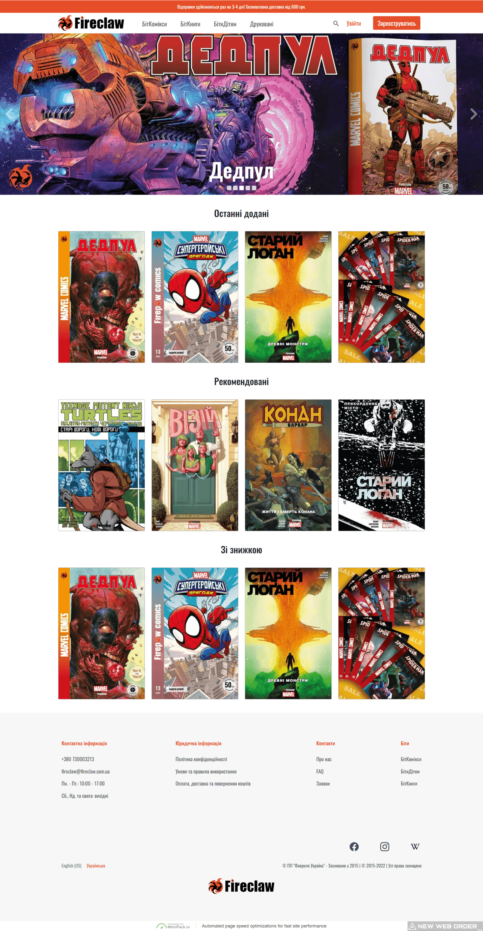
Team Fireclaw approached me to assist them in improving their existing website. Despite having a significant number of visitors, they were not converting into clients. After conducting some usability and general assessments, it became apparent that a new website was necessary as the existing one had major issues. I got to work with my tools and presented them with an overhauled Fireclaw website. They were pleased with the results and were planning on launching an English version of their site, which would host web novels instead of physical novels as on the original Ukrainian version.

As soon as I received the request to design the English version of Fireclaw's website, I started working on it diligently. I spent a significant amount of time going through various iterations, making changes and refinements as necessary to ensure that the website met all the requirements and exceeded the expectations of the client. With each iteration, the design improved, and I was able to incorporate new features and functionality that made the website more user-friendly and intuitive. Finally, after several rounds of revisions and testing, I presented the final version of the website to the client. They were thrilled with the outcome, and the website spoke for itself, showcasing its stunning visuals, engaging content, and seamless functionality.

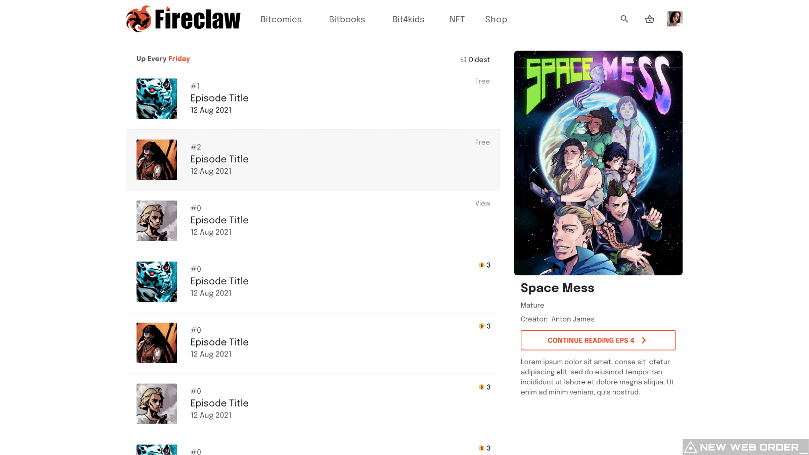
Episode listings page for the English version

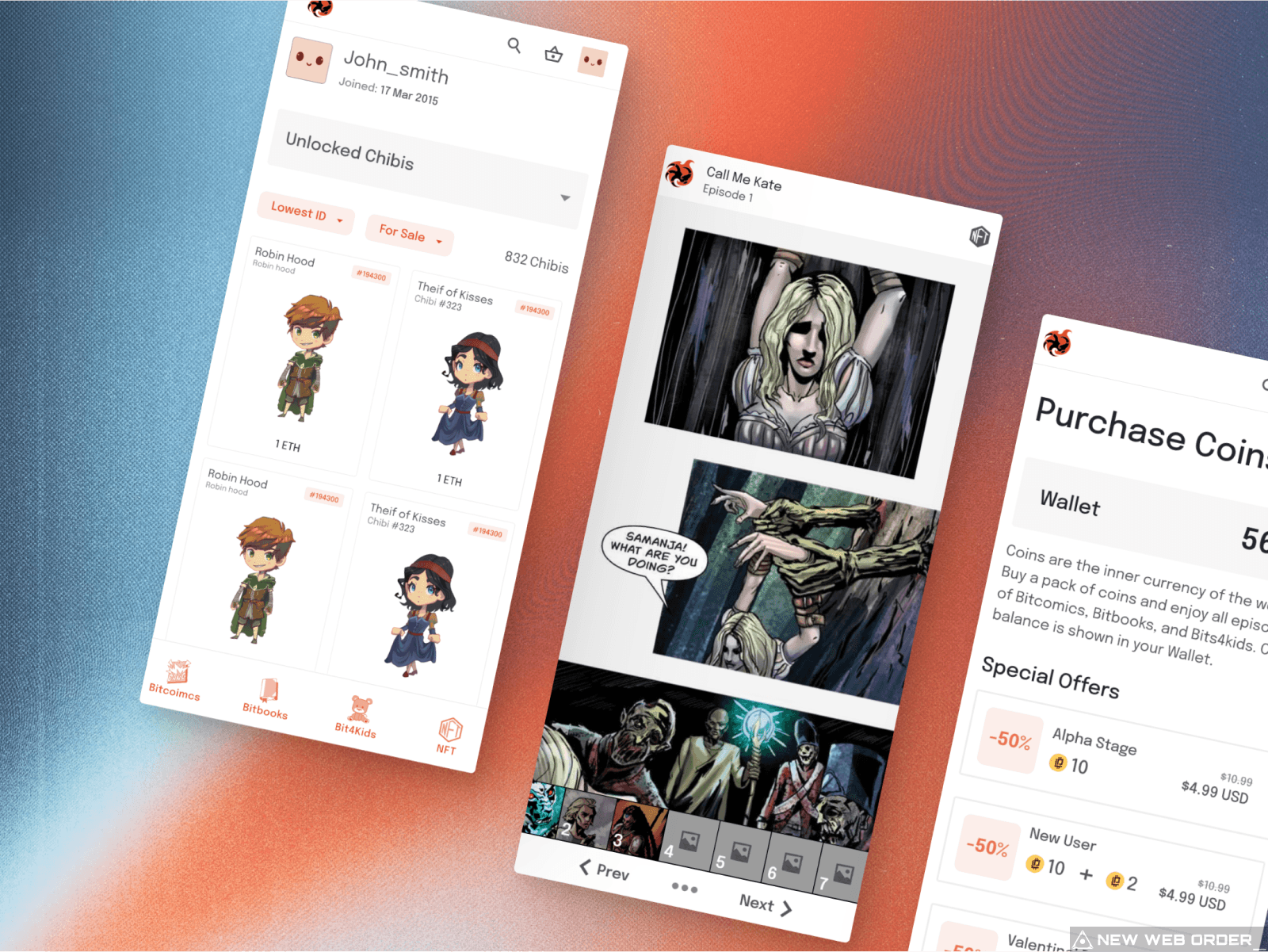
Despite the heavy animations, I was able to fully optimize the site for most modern mobile devices.

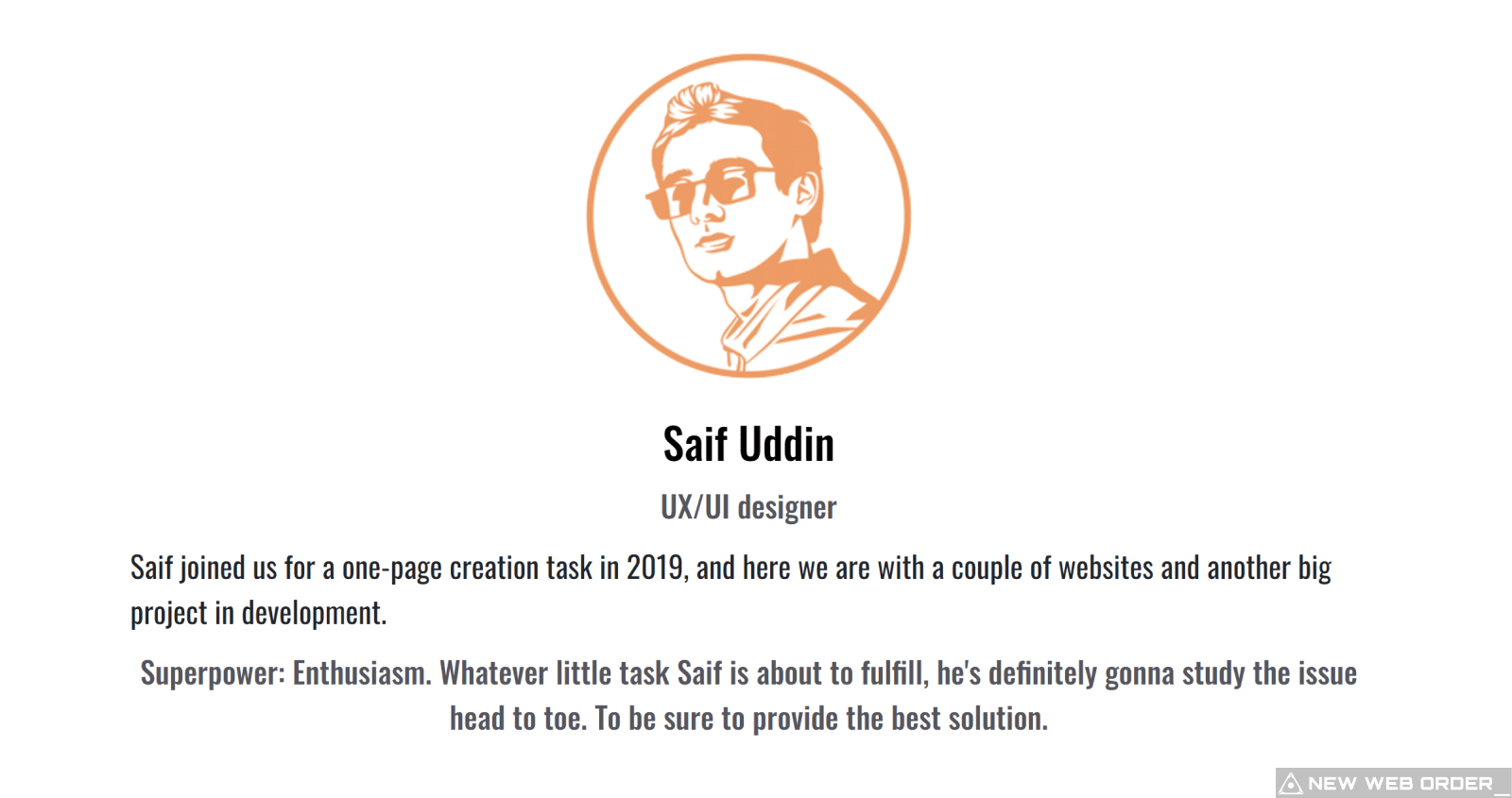
A testament to my handwork, as seen on the about page of the website.